Southwest Airlines
Extending Southwest Airlines’ rebrand into customer-facing brand applications, product UI, and campaign concepts at Razorfish.
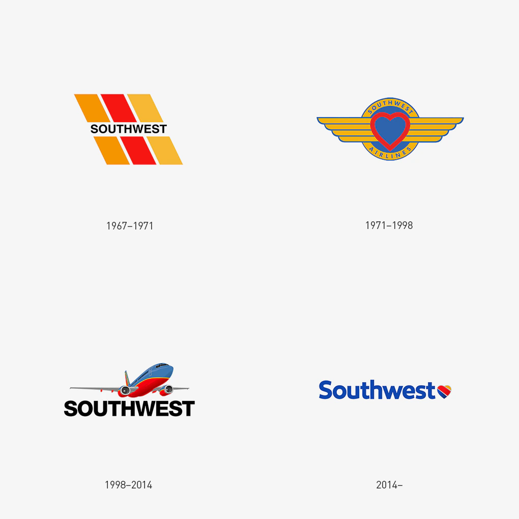
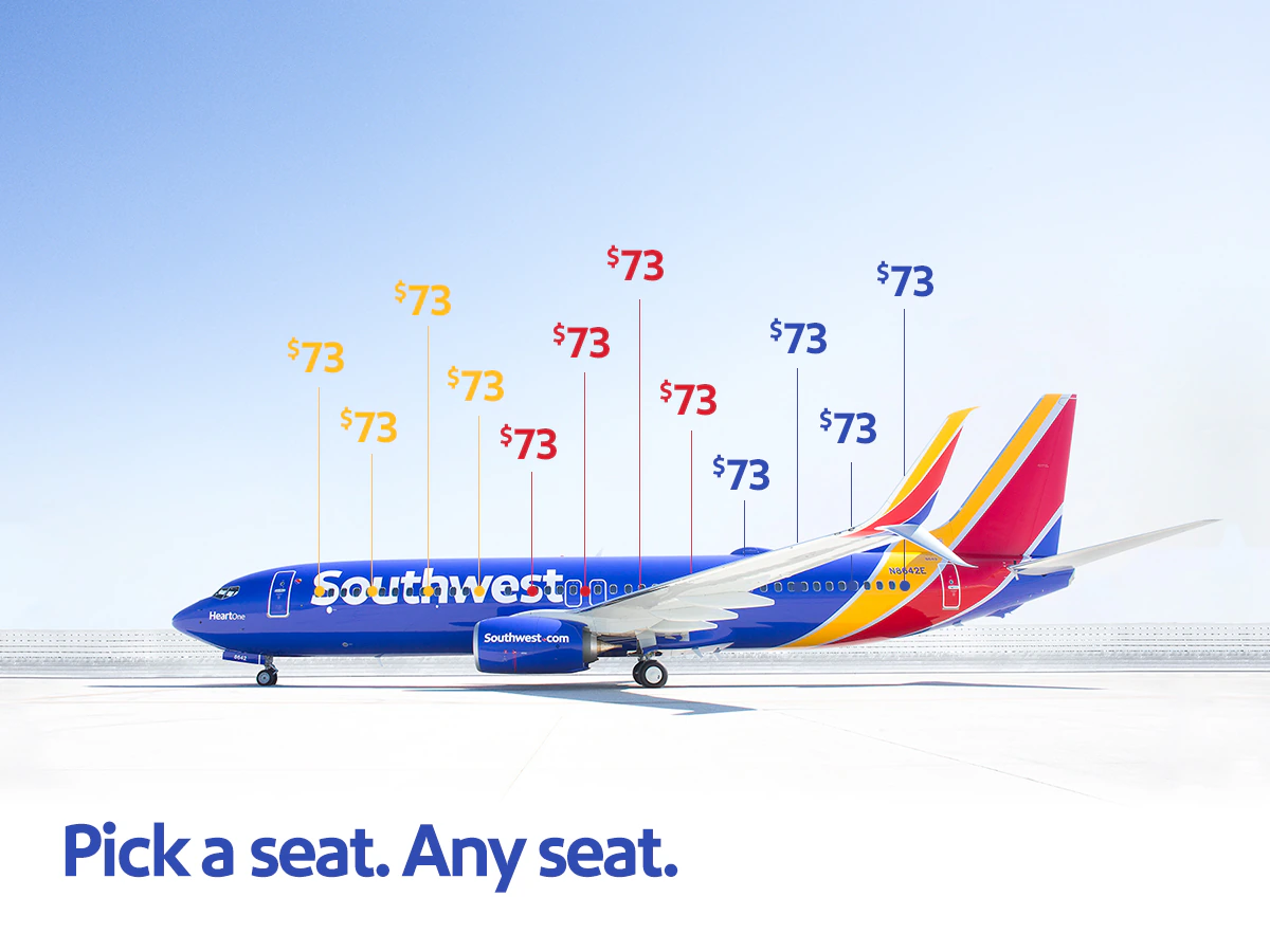
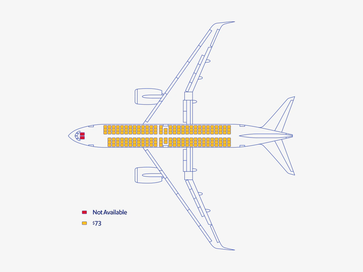
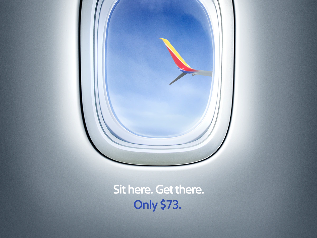
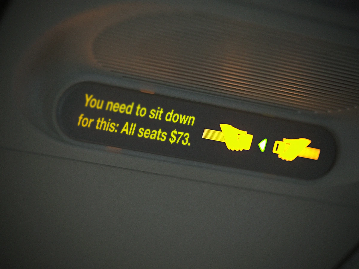
While at Razorfish New York, I joined the Austin-based team translating Southwest Airlines’ rebrand into brand applications, product UI, and campaign concepts for social and the homepage. Our focus was to make each touchpoint feel current without losing the direct, friendly character people already knew.
Prioritizing what travelers need first
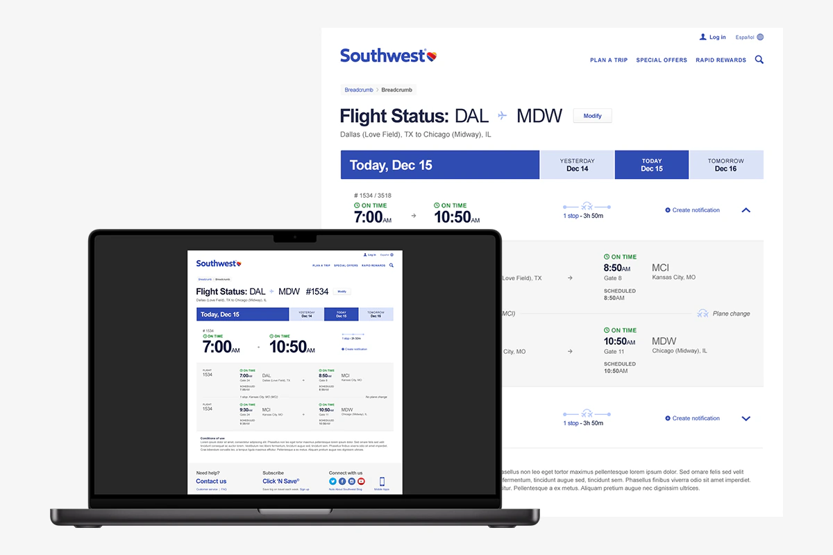
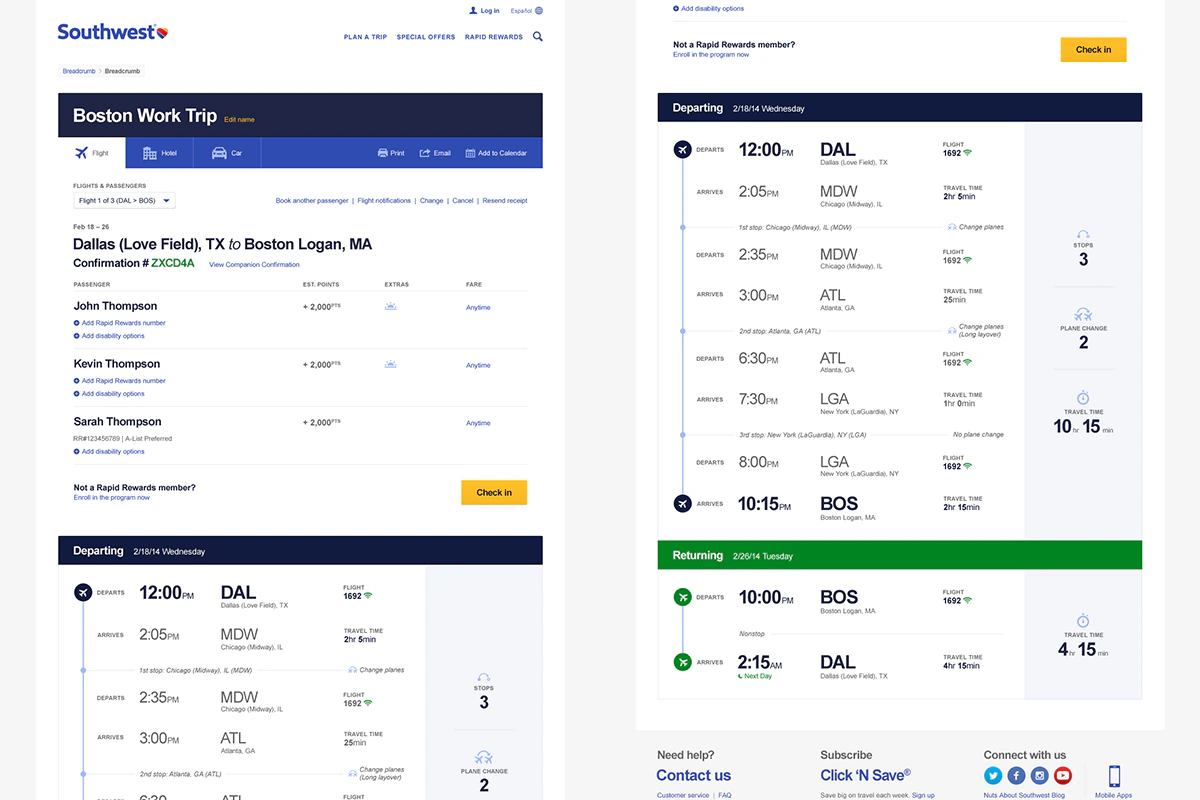
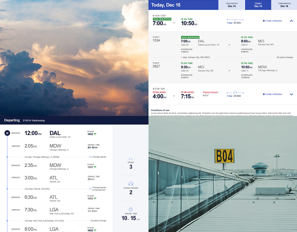
I partnered with UX to translate the new brand system into flight status and reservation details. Together, we organized information-heavy screens around the questions travelers need answered first, creating a clear hierarchy for status, timing, and booking details while keeping secondary information easy to find.
One heart across the whole experience
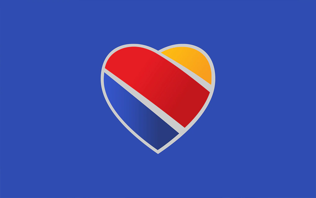
Southwest already used hearts throughout its brand, but hundreds of different versions made the identity feel inconsistent. The 2014 rebrand simplified them into one Heart symbol and used it everywhere, from the underside of each aircraft to airports, packaging and digital products. Lippincott created the identity system, and Razorfish brought it into the digital experience shown here.
95% appeal
The rebrand was well received: 95% of existing Southwest flyers responded positively. Consideration among business travelers rose 7%, while brand commitment reached 68% in the broader market. The digital work shown here was Razorfish’s contribution to that larger effort.